Learn CSS Positioning Quickly: Easy And Quick Guide

I am a self-taught developer. i'm currently enrolled in a Software Engineering programme by ALX Africa & Holberton School to improve my skills and stack. I program in the languages [Python, HTML, CSS]. Exploring Technical writing
As a web developer, having a strong grasp of CSS positioning is a crucial skill that can greatly enhance the aesthetics and functionality of your web designs. By being able to position elements precisely where you want them on a page, you can create visually appealing layouts that engage your audience and enhance their experiences. CSS positioning can be a tricky concept to understand especially for beginners. In this article, we will explore the different positioning properties and how to use them effectively.
To start using CSS positions, you need to have some elements in your HTML. For this example, we'll use a simple grid consisting of a div with the class of container and 12 items nested inside of it, each with the class of item.
<!DOCTYPE html>
<html lang="en">
  <head>
    <meta charset="UTF-8" />
    <meta http-equiv="X-UA-Compatible" content="IE=edge" />
    <meta name="viewport" content="width=device-width, initial-scale=1.0" />
    <link rel="stylesheet" href="base.css" />
    <link
      href="https://fonts.googleapis.com/css2?family=Roboto:wght@100;400;700&display=swap"
      rel="stylesheet"
    />
    <title>Positions</title>
  </head>
  <body>
    <section>
      <div class="container">
        <div class="item item-1">1</div>
        <div class="item item-2">2</div>
        <div class="item item-3">3</div>
        <div class="item item-4">4</div>
        <div class="item item-5">5</div>
        <div class="item item-6">6</div>
        <div class="item item-7">7</div>
        <div class="item item-8">8</div>
        <div class="item item-9">9</div>
        <div class="item item-10">10</div>
        <div class="item item-11">11</div>
        <div class="item item-12">12</div>
      </div>
    </section>
  </body>
</html>
now let's make a file "base.css" and add some simple style to make it look good.
body {
  margin: 0;
  padding: 0;
  line-height: 1.6;
  word-spacing: 1.4px;
  font-family: 'Roboto', sans-serif;
  background-color: white;
  color: black;
}

h1 {
  font-size: 3rem;
}

section {
  height: 100vh;
  display: flex;
  justify-content: center;
  align-items: center;
}

.container {
  display: grid;
  grid-template-rows: repeat(3, 150px);
  grid-template-columns: repeat(4, 150px);
  grid-gap: 1em;
}

.item {
  width: 150px;
  height: 150px;
  display: flex;
  justify-content: center;
  align-items: center;
  border-radius: 10px;
  color: #6b6666;
  font-weight: 700;
  font-size: 1.25rem;
}

.item-1 {
  background-color: #82a8cd;
}

.item-2 {
  background-color: #66cdaa;
}

.item-3 {
  background-color: #b4eeb4;
}

.item-4 {
  background-color: #82cdcd;
}

.item-5 {
  background-color: #eedd82;
}

.item-6 {
  background-color: #82a8cd;
}

.item-7 {
  background-color: #66cdaa;
}

.item-8 {
  background-color: #b4eeb4;
}

.item-9 {
  background-color: #82cdcd
}

.item-10 {
  background-color: #eedd82;
}

.item-11 {
  background-color: #82a8cd;
}

.item-12 {
  background-color:     #66cdaa;
}
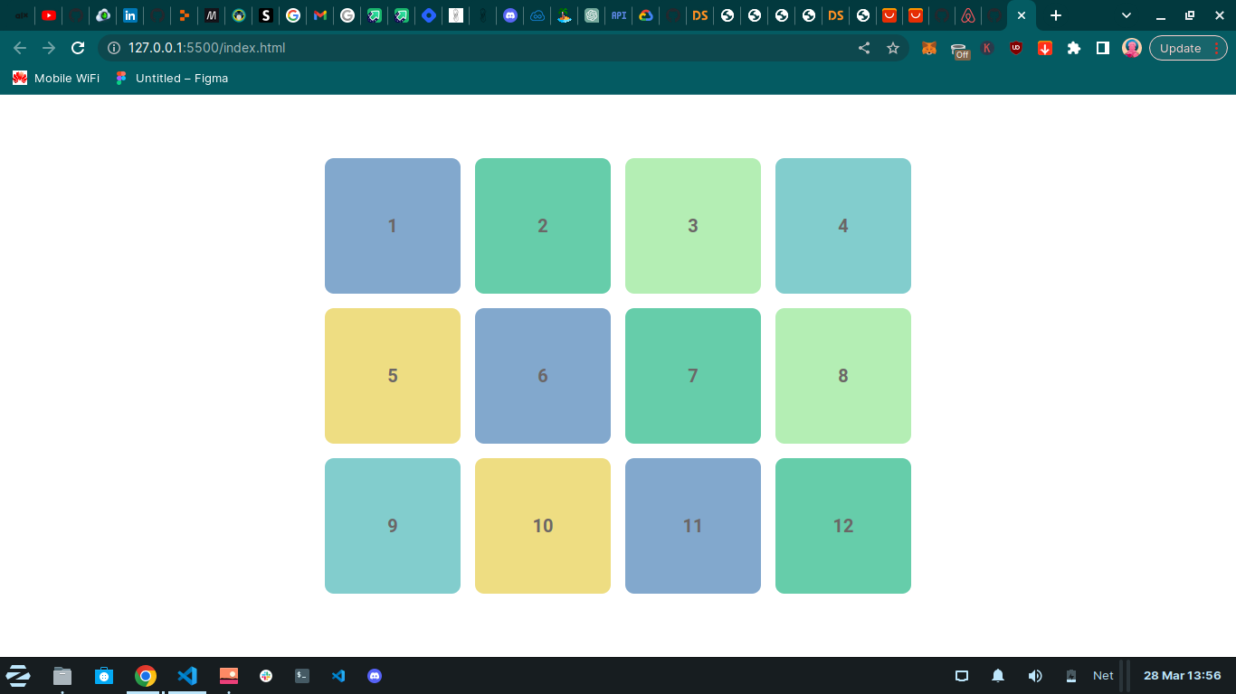
When you save and run the code, you can see that we have a grid but you don't need a container with 12 items and a grid to start using the CSS positioning properties. All of this is just for demonstration purposes.
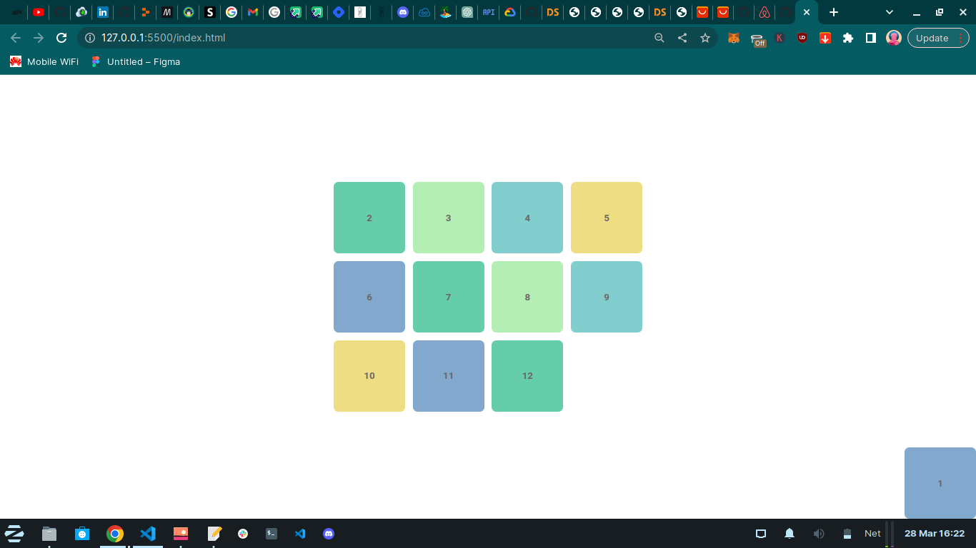
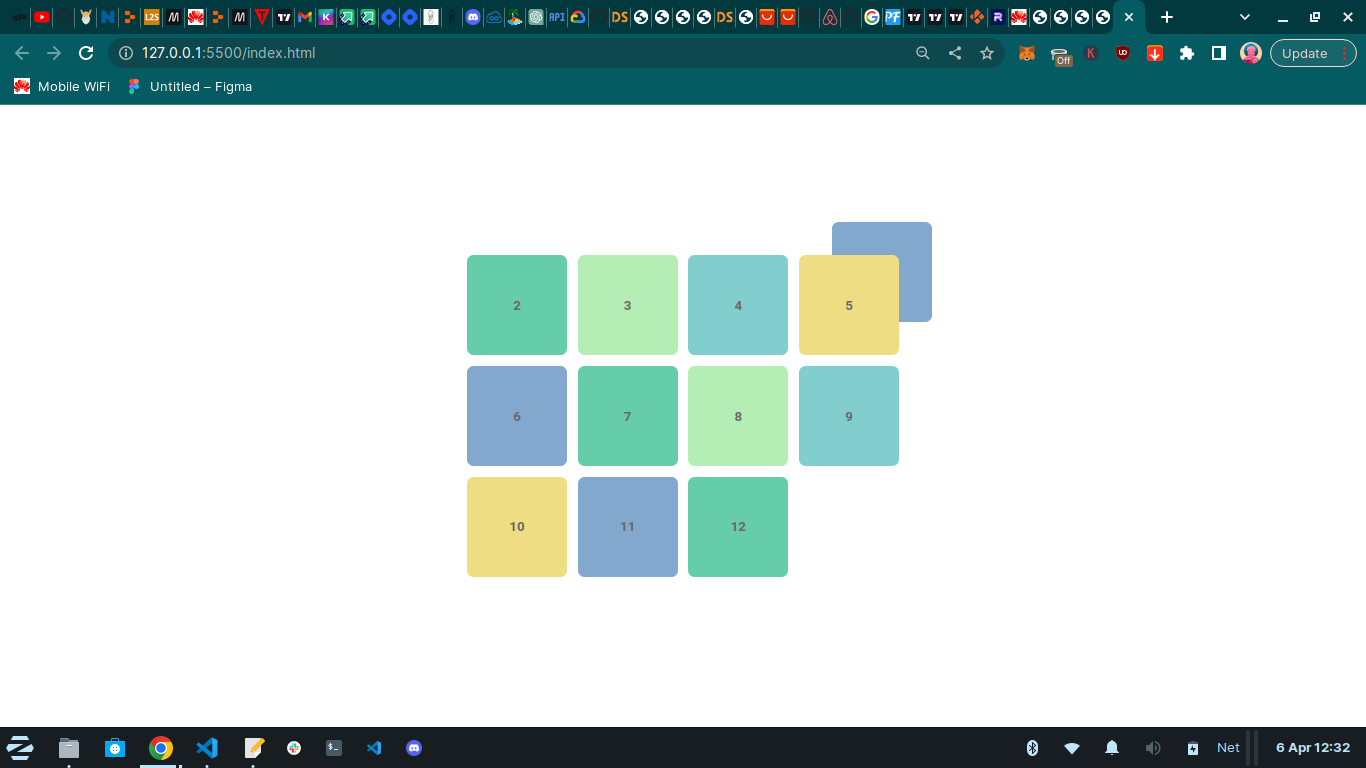
Now let's get into the CSS code. We'll select the "item-1" in our grid by its class name and give it the "position" property. There are five position values in total: absolute, relative, fixed, sticky, and static. When we set the position on our first item to absolute.
.item-1 {
  position: absolute;
}

we see that item two disappears and the reason is that it's hidden underneath item one. To move item one, we can use the top, right, bottom, and left properties. These properties are unlocked when we assign a "position" property to an element.
For example, if we give the "top" property a value of 0px, our item is positioned at the top of the page.
.item-1 {
  position: absolute;
  top: 0;/*added*/
}

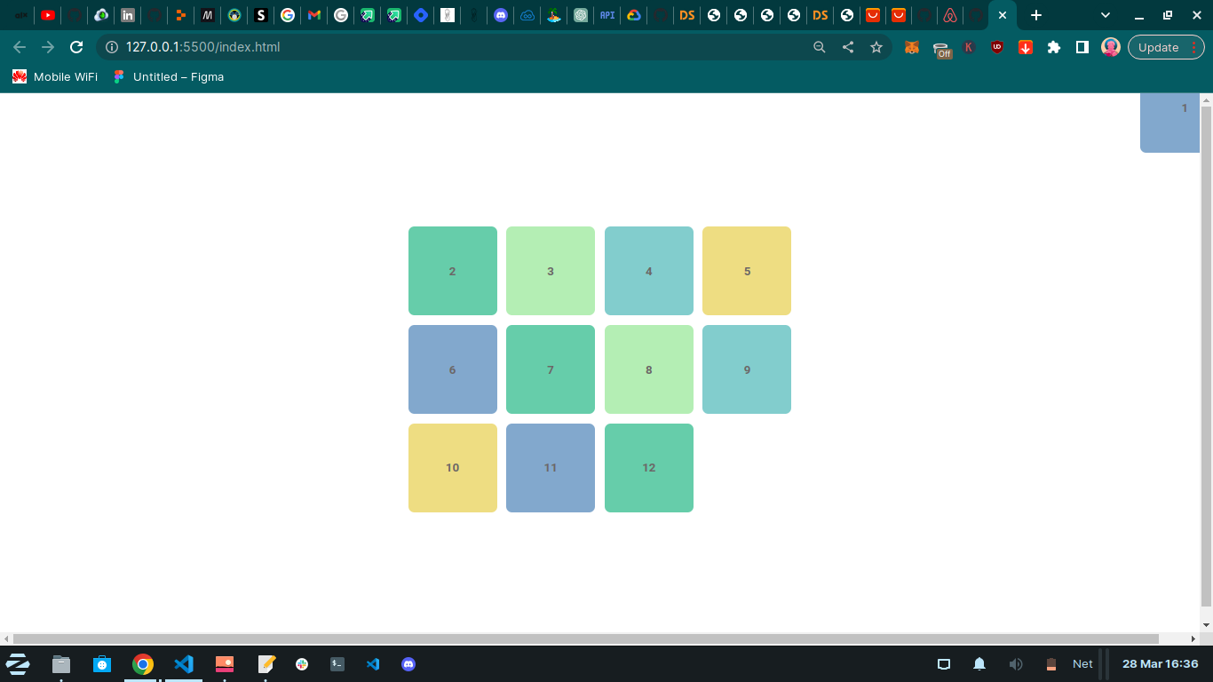
When we set item one to have a position of absolute, it gets removed from the grid and the entire document. Elements that are assigned a position of absolute are removed from the document, no space is created for them, and other elements will behave as if that element never existed.
If we set the "left" property to 0px, our item is now positioned at the top-left corner.
.item-1 {
  position: absolute;
  top: 0;
  left:0;/*added*/
}

If we set the "bottom" property to 0 pixels, nothing happens because it doesn't make sense to have both a top and a bottom. We can comment out the top property and set the bottom property to 0px.
.item-1 {
  position: absolute;
  /*top: 0;*/
  left: 0;
  bottom: 0; /*added*/
}

Our item is now positioned at the bottom-left corner. The same goes for the left and right properties.
If we use one of them but not both at the same time, we can position our item in the top-right corner by commenting out the left property and setting the "right" property to 0px.
.item-1 {
  position: absolute;
  /*top: 0;*/
  /*left: 0;*/
  bottom: 0;
  right: 0; /*added*/
}
We can also comment out the bottom property and set the top property to 0px to position our item in the top-right corner.
.item-1 {
  position: absolute;
  top: 0;
  /*left: 0;*/
  /*bottom: 0;*/
  right: 0;
}

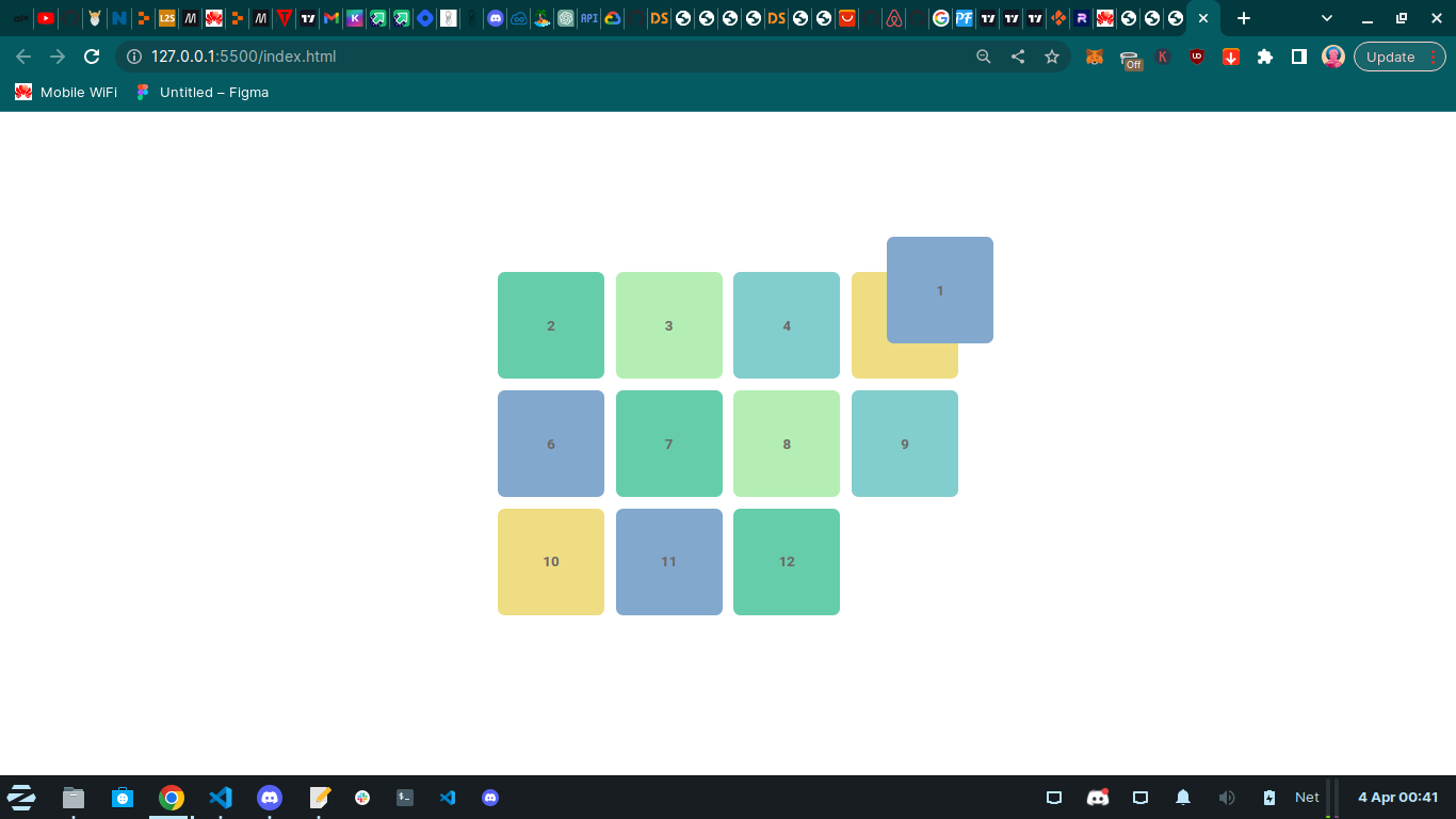
To add some more depth to our design, we can give our top and right properties some negative numbers. For example, we can set both to -50px.
.item-1 {
  position: absolute;
  top: -50;
  /*left: 0;*/
  /*bottom: 0;*/
  right: -50;
}
our item is now half visible. However, this causes some horizontal scrolling, so we can select the body and give it the "Overflow X : hidden" to get rid of it.
body {
  margin: 0;
  padding: 0;
  font-family: 'Roboto', sans-serif;
  background-color: white;
  color: black;
  overflow-x: hidden; /* getting rid of scroll bar*/
}
Notice all this time while we were defining the value of top, bottom, left, and right. we were setting "item-1" relative to the entire page and not the container of the "item-1".
To set "item-1" relative to its parent "container", we'll need to select the container and give it a position of "relative".
.container {
  display: grid;
  grid-template-rows: repeat(3, 150px);
  grid-template-columns: repeat(4, 150px);
  grid-gap: 1rem;
  position: relative; /
}
now we see that "item-1" is positioned relative to its parent "container" and not the entire page. how this work under the hood is on the HTML. "item-1" check the parent, if it has a position property and if it doesn't, it checks the next parent until it finds one with a "position" property and if it doesn't find one, then the default position is set relative to the HTML.
Also, we noticed that "item-1" is stacking itself above "item-5". To layer "item-1" underneath "item-5" we can use "z-index" and give it a value of negative one "z-index: -1".
.item-1 {
  background-color: #82a8cd;
  position: absolute;
  top: -50px;
  /* left: 0; */
  /* bottom: 0; */
  right: -50px;
  z-index: -1;/*added*/
}

Sticky position
if we select "item-2" and give a position of static.
.item-2 {
  background-color: #66cdaa;
  position: static;
}

After giving a position of static, we can see that nothing happened. If we give it a top of zero "top:0".
.item-2 {
  background-color: #66cdaa;
  position: static;
  top: 0;
}

Nothing happens. if we give it a bottom of 1000px;
.item-2 {
  background-color: #66cdaa;
  position: static;
  top: 0;
  bottom: 1000px;
}
Nothing happens because static elements do not have access to the top, left, right, and bottom properties, nor do they have access to the z-index property.
Relative position
if we give "item-3" a position of relative. nothing happens, unlike the position of absolute.
.item-3 {
  background-color: #b4eeb4;
  position: relative;
}

if we give "item-3" a top of 100px .
.item-3 {
  background-color: #b4eeb4;
  position: relative;
  top:100px; /*added*/
}
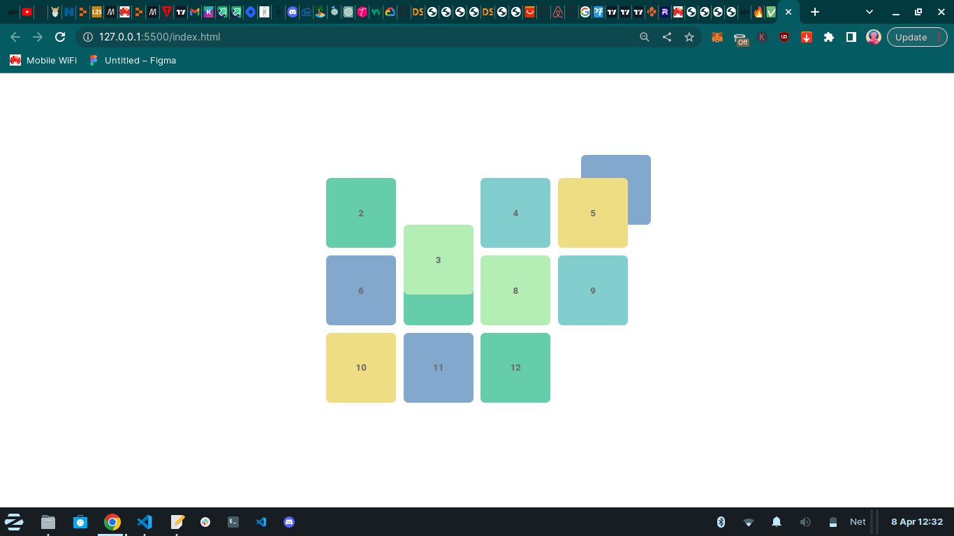
we can see that "item-3" has been pushed 100px from the top. unlike static position, the relative position has access to the top, left, right, bottom and z-index properties.
if we give "item-3" a left of 100px.
.item-3 {
  background-color: #b4eeb4;
  position: relative;
  top:100px;
  left: 100px;
}

from the above images, we can see that "item-3" was moved 100px away from the left. unlike the absolute position, the relative position remains in the normal flow of the document. Use relative position when you want to keep your element in the normal flow of the document and use absolute position when you want to remove your element from the normal flow of the document.
Sticky And Fixed Position
The two final positions are fixed and sticky, they both stick an element into position but they do it slightly differently. The fixed position behaves very similarly to the absolute position, just like the absolute position, elements with the position of fixed are removed from the document.
When we give "item-4" the position of fixed.
.item-4 {
  background-color: #82cdcd;
  position: fixed;
}

we get the same behaviour as we did when we were working with the absolutes position. Item-4 was removed from the entire document and is currently layered on top of Item-2 which is why we can't see Item 2.
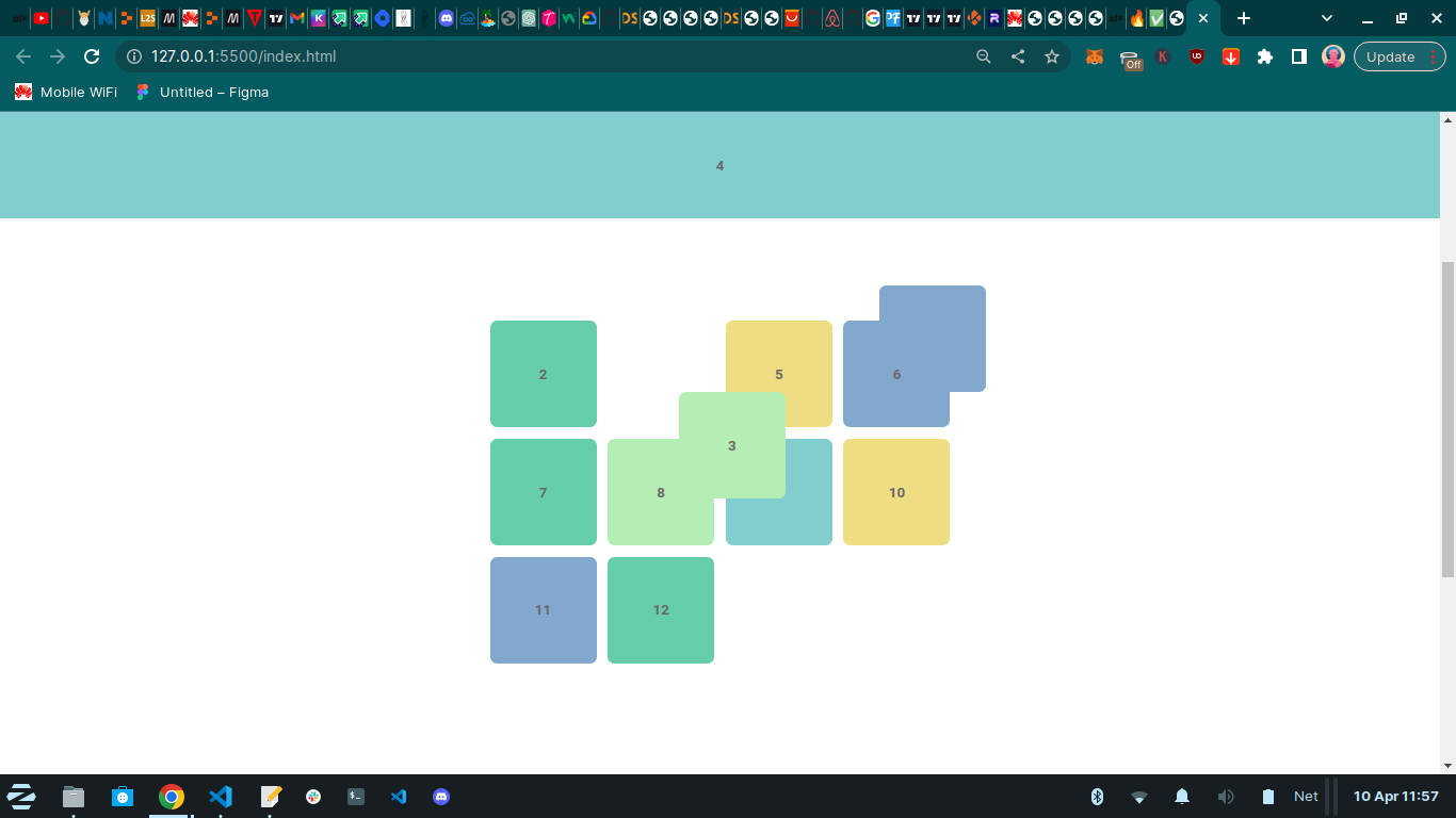
However, one aspect where the fixed position is different from the absolute position is when we start scrolling. if we change the "section" height from 100vh to 200vh, we now have enough room to scroll and a scroll bar.
section {
  height: 200vh;/*changed*/
  display: flex;
  justify-content: center;
  align-items: center;
}

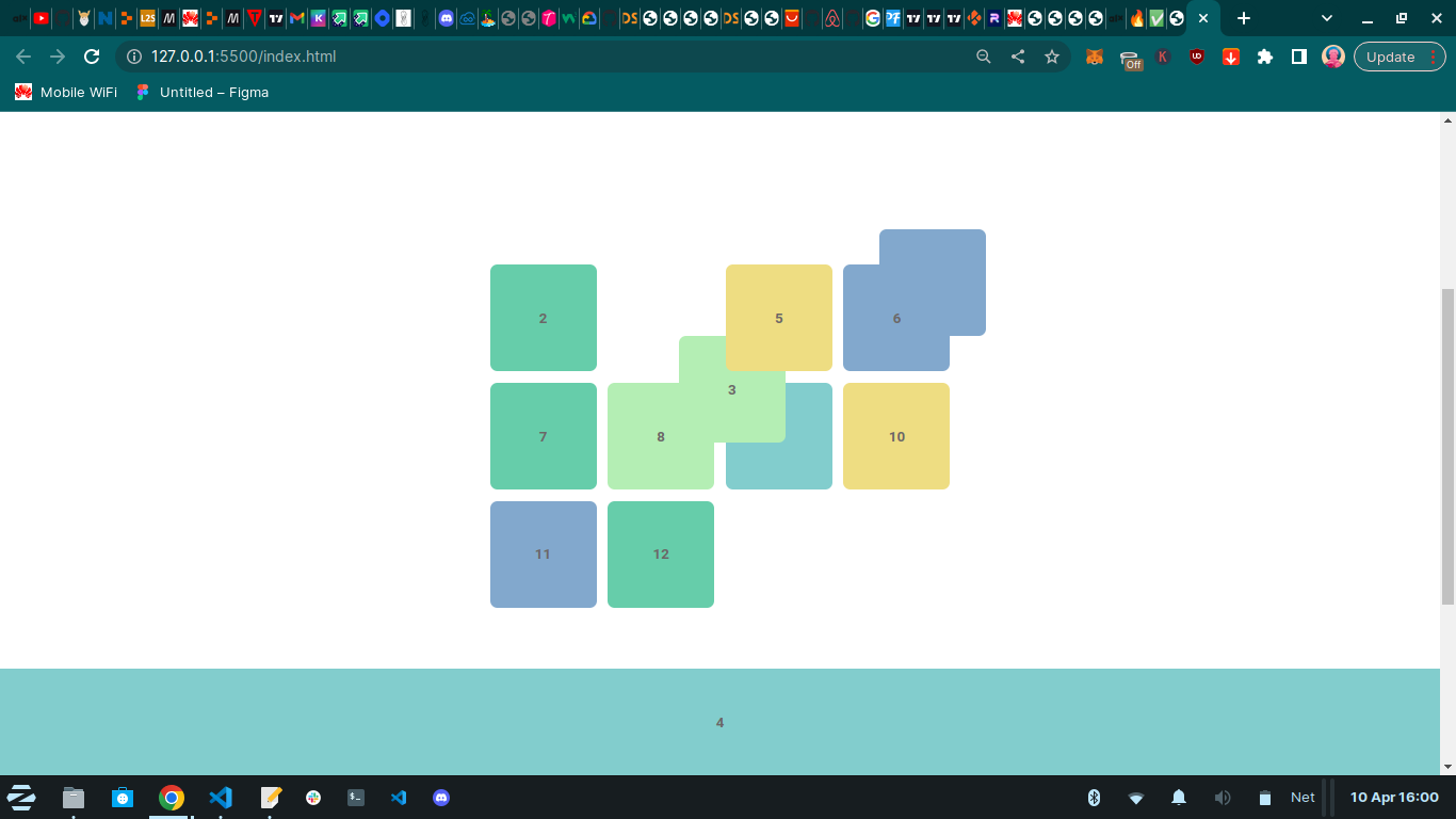
We see item-4 is now following us when we're scrolling the page. The second aspect where the fixed position differs from the absolute position is unlike the absolute element, a fixed element is always positioned relative to the HTML element. The fixed position retains its placement on the screen, while the absolute position remains fixed in relation to its parent element.
As a result, when a user scrolls through a web page, an element that has been fixed will continue to follow them, whereas an element with an absolute position will remain in its designated location within its parent element.
if we give item-4 a "top: 0", this will make it stick to the top of the page. when we also give it a "left: 0px", "border-radius: 0", "width: 100%" and " z-index: 1".
.item-4 {
  background-color: #82cdcd;
  position: fixed;
  top: 0;
  left: 0;
  border-radius: 0;
  width: 100%;
  z-index: 1;
}
we now have a header. We can also make it to be a bottom Header by replacing the "top:0" with "bottom:0".
.item-4 {
  background-color: #82cdcd;
  position: fixed;
  bottom: 0; /*added*/
  left: 0;
  border-radius: 0;
  width: 100%;
  z-index: 1;
}
Sticky position
The sticky position works similarly to both relative and fixed. when we give item-5 position of sticky, item-5 gets layered above item-2. If we scroll the page nothing happens.
item-5 {
  background-color: #eedd82;
  position: sticky;
}

When we give item-5 a "top: 0px" and start scrolling down, item 5 starts scrolling down with us until it hits the end of the container.
.item-5 {
  background-color: #eedd82;
  position: sticky;
  top: 0; /*added*/
}

Sticky positioning only works when we include a top property. This top property specifies the space between the element and the top of the viewport as we scroll down the page. If we set the top property to 50 pixels, the element will only stick to the top of the viewport after a gap of 50 pixels exists between the top of the viewport and the element.
CSS positioning is a powerful tool that allows web developers to control the layout of web pages. With the knowledge of the different positioning values like relative, absolute, fixed, and sticky, developers can create visually appealing and functional designs. However, careful planning and consideration are necessary when positioning elements since they can affect the flow and accessibility of content. Nonetheless, CSS positioning offers opportunities to create engaging and dynamic web pages that can effectively communicate messages to users.


